Ergonomics Diary 1
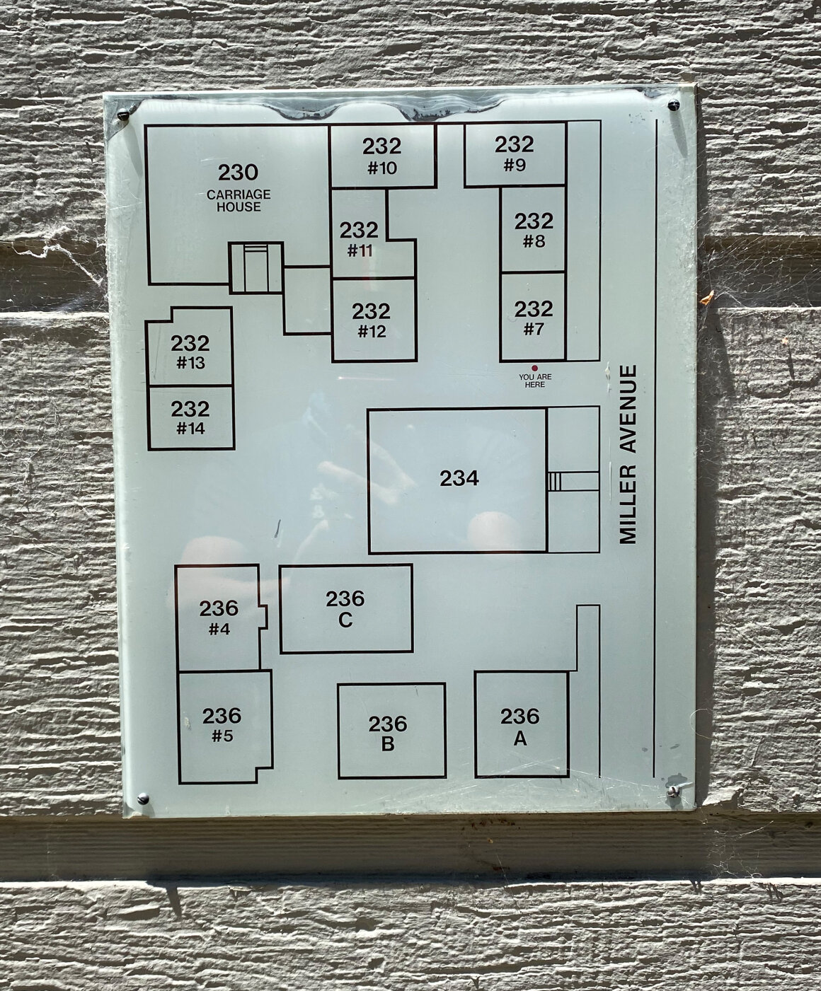
Perhaps too literal, but this acrylic sign posted at a small neighborhood development provides an easy mappingof the convoluted organization of the condo units. This map is a convenience for delivery drivers (of which there is an abundance of different unfamiliar faces now) to find exactly which unit the package they are delivering needs to go. As the lost individual stands at the “YOU ARE HERE” location in the real world, they should be able to more readily determine where to go by the “spatial correspondence between [the map’s] layout” of the addresses and the addresses they need to deliver to. I believe there is also an argument that the “YOU ARE HERE” even provides a basic conceptual model to observers of the development’s layout. Similar to Norman’s description on page 21 of vehicle controls having “a compelling conceptual model of the how the operation of the control affects the vehicle”.
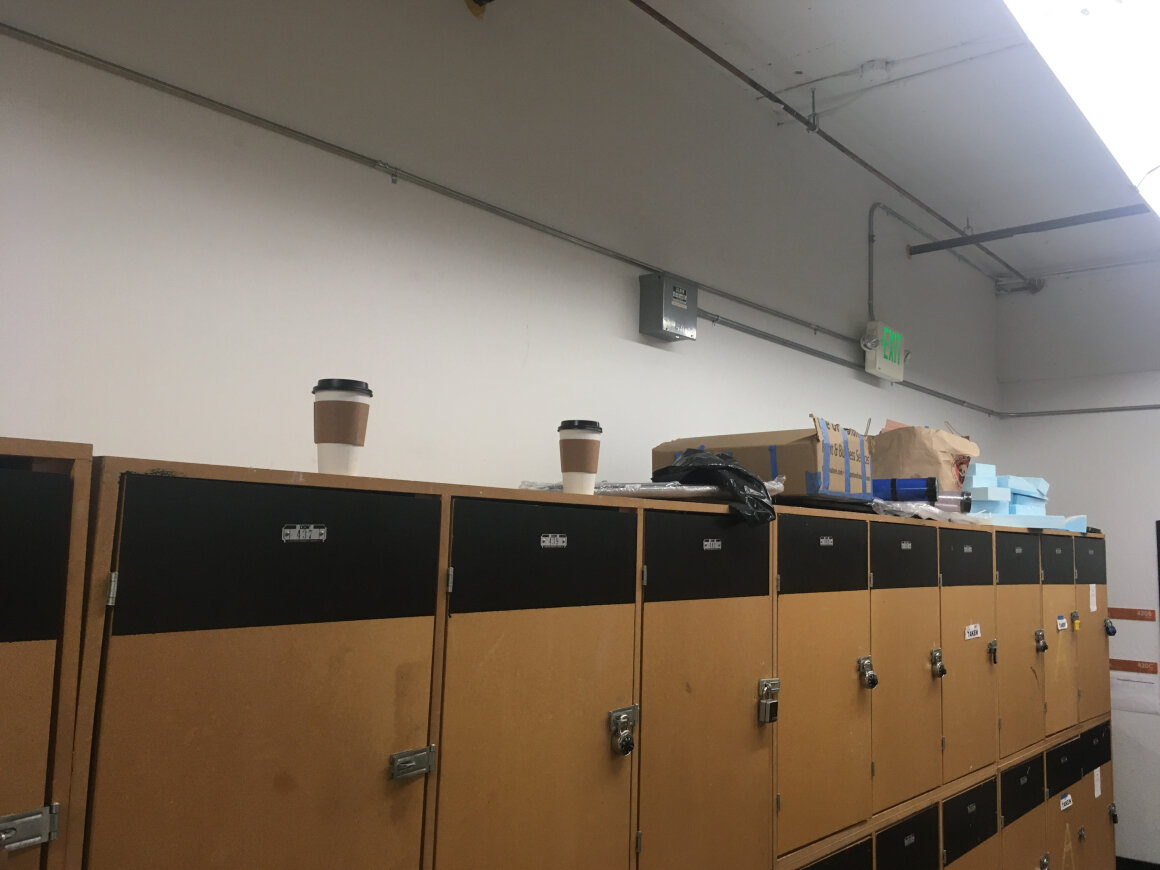
Similar to an example found in Design of Everyday Things, I snapped this photo several months ago of the Industrial Design Warehouse lockers. It is showing the top of the locker bank affording the ability to support other objects (despite signs advising the contrary). As also described in the book, the disregarding of those signs acted as a signifier that it was a place to put a coffee, boxes, materials, and other supplies. An example on page 18 describes, these “accidental affordances can become strong signifiers”. Perhaps the signs the administration posted weren’t as significant as intended?
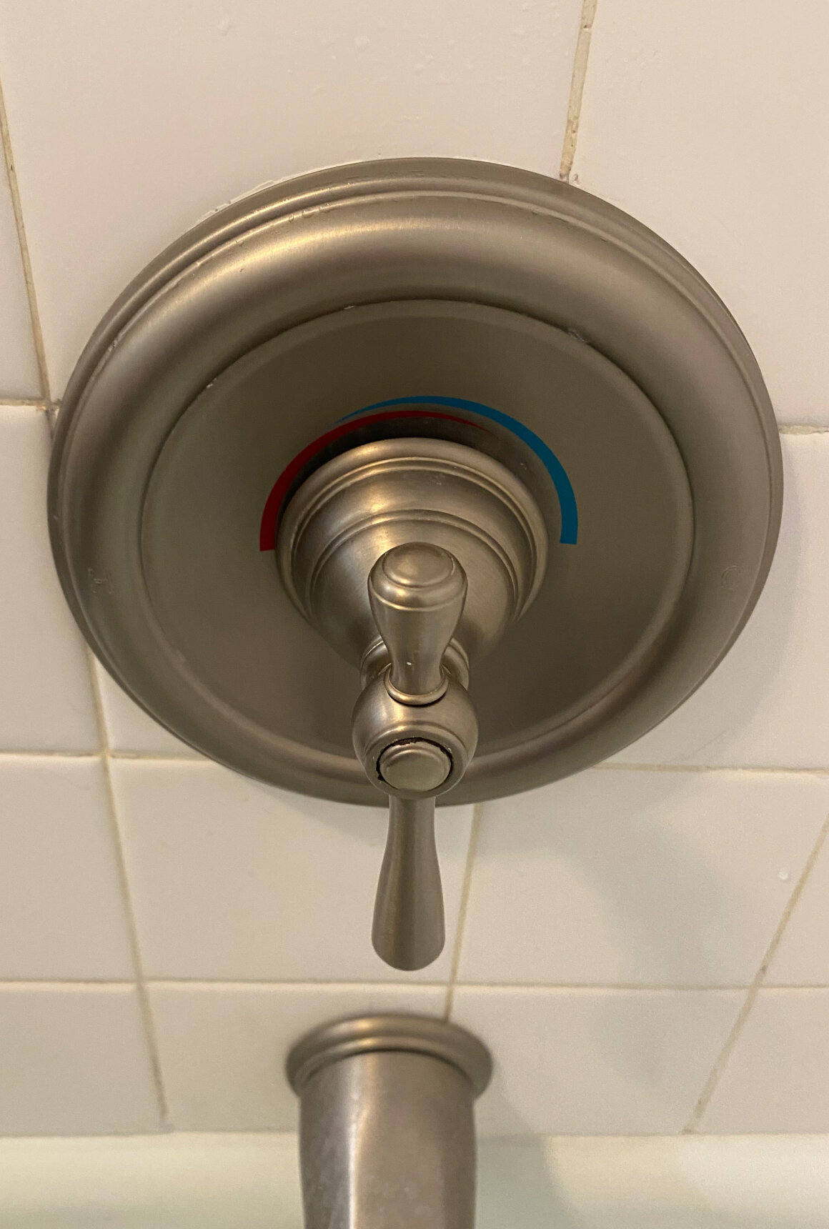
This image of my shower water control is one that I manage to continually be confused about. As an example of bad feedback, a bleary-eyed and foggy-brained in the morning, I don’t frequently examine which direction to turn the center handle for comfortable water. Upon further examination of the color coding (signifiers of temperature), the direction of rotation functions in the opposite of what I personally find intuitive. The colored arcs are more akin to directional arrows instead of adjustment of temperature. The wider section of the colored arrow doesn’t indicate more cold (blue) or more hot (red), but the opposite. It is instead the narrow section is indicating the user to rotate in that direction for more cold, or more hot. Feedback communicates the results of an action as stated on page 23 of DOET and “even a delay of a tenth of a second can be disconcerting” or scalding as the case may be with this faucet handle.
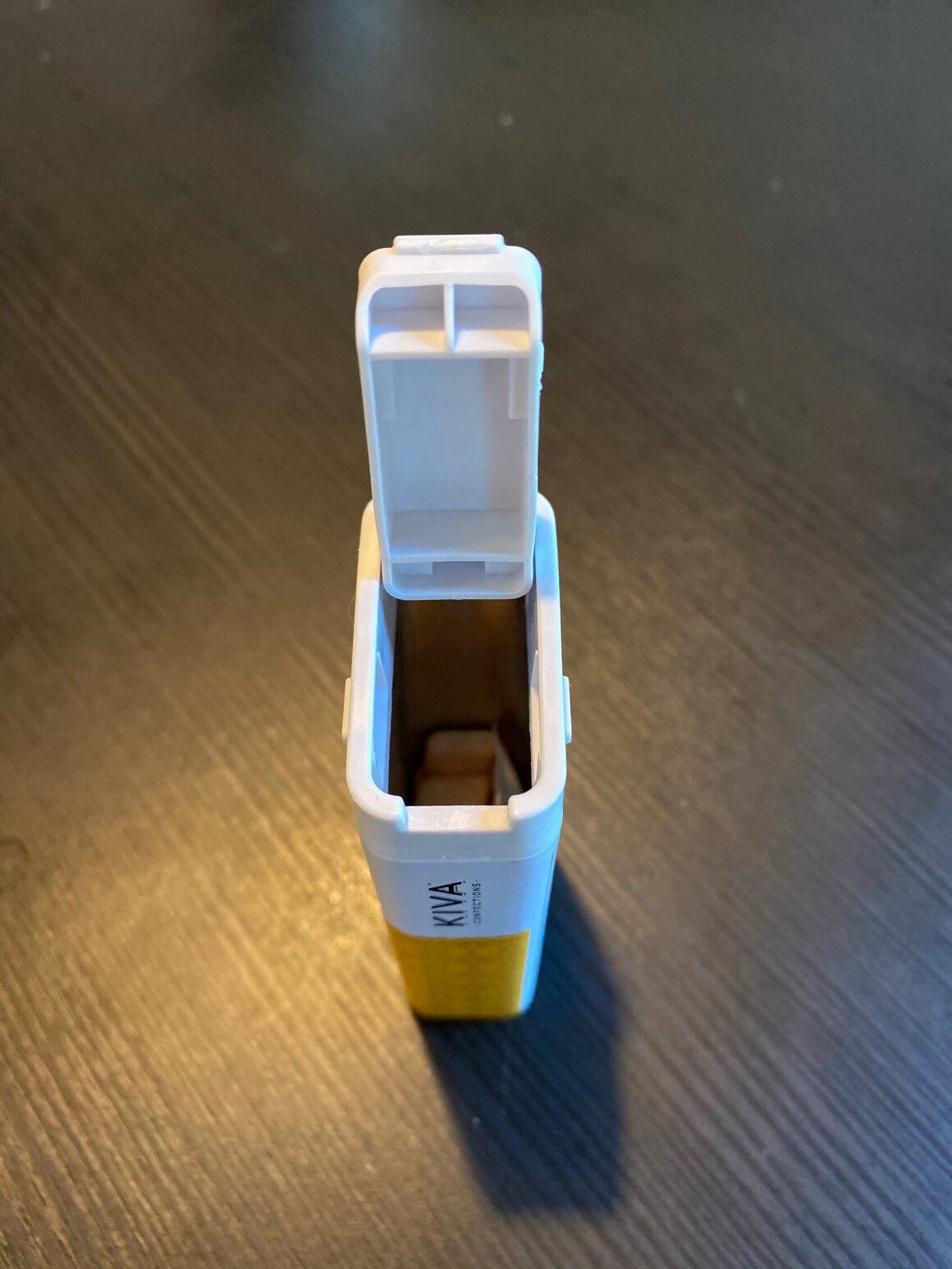
An example of a constraint I have enjoyed examining is shown in this image of a tin of edible mints. Different from the typical Tic Tac container this lid features a child-proof mechanism that constrains less dextrous hands from opening it. The dexterity involved requires a considerable pinching force on the two symmetrical tabs on the side, while leveraging the top flap open with a fingernail on the short side. This constraint seems obvious in that it directly controls who can open the container—at least to a degree. This type of child-proofing does have potential limitations, possibly with an adult suffering from arthritis. If this seems too specific, I think if we look at society at large as the user, the constraint makes more sense in that it is “preventing the human error” of under-aged population ingesting potentially harmful chemicals. Following through with other aspects of this design is also the fact that there are no instructions or markings provided telling the user how to open the container, the protruding tabs and front edge slot are the only signifiers of how to crack this vessel open.
This Frigidaire dehumidifier has a few examples of these Principles of Interaction. The recessed cavity that is approximately the width of an adult hand is a signifier that brings a user to the affordance of the device’s portability by it’s slide-out handle. The presence of this handle is the signifier which “communicates how to use” this product—how to move this product specifically. There is even evidence of unintentional significance in the “on-off” button shown by the wear marks on the plastic. The six buttons themselves are also mapped to their respective indicator lights directly above them. Imagine how confusing this dehumidifier would be with that alignment?
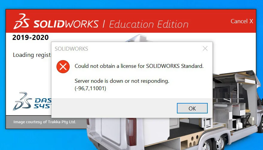
Another example of a feedback interaction was this error I received just this week when attempting to install this SolidWorks software. Not knowing enough about the application’s licensing procedure (or the Windows Operating System for that matter. I was left helpless without a clue as to what my next steps would ned to be to successfully install this software. After clicking “OK” the installer merely quit with little guidance or definition as to how to “obtain a license” nor what a “Server node” is. This is admittedly a separate issue, like Don Norman states on page 23, “Feedback must also be informative,” the installer system did at least provide some explanation; my issue was that it was effectively in a different language that I didn’t understand.
My initial thought regarding a system image is taken from my experience working on and selling bicycles in a retail shop. Many times over I had the experience of witnessing an about-to-be-owner of a brand new bike expressing legitimate shock that the purchase price they are preparing the put down would not be the last amount of money they would need to spend on “bicycle”. I state it that way because to me, their system image of bicycle ownership was just that simple. There was frequent surprised reactions when they were informed that regular maintenance and up-keep that cost money down the road. Their system image did not include that, nor the wearing down of components, accidental flat tires, security, upgrades etc; it merely consisted of the pleasure of riding their bicycle. I always hated the feeling of being a joy-kill when I informed them of my system image of “bicycle”.